Retention Lifecycle.

Lead designer · A designed journey from purchase to day 60, with the 30-Day Milestone shipped as the first phase.
Why it matters
Growth → Retention
with ~9M glasses sold, the priority moved from selling more to keeping people in them — central to Meta's bet on owning its hardware-and-software ecosystem.
One journey
retention had been a series of scattered fixes. The reframe made it one designed path from purchase to day 60.
The problem
Retention was slipping, and the playbook couldn't catch it.
The churn

The glasses ended up in a drawer.

The first weeks run on novelty — a photo here, a song there, a question for the AI. But nothing turns into routine, so when the novelty fades there's no habit to hold on to. Weekly use slides from day 30, and the gap is widest by day 60.
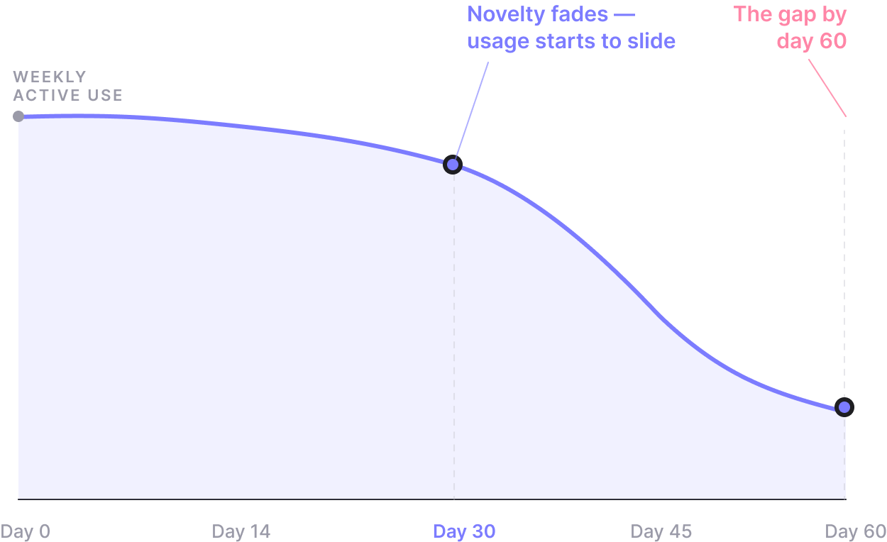
Weekly active use sliding from day 0 to day 60, the drop starting at day 30
The old playbook

The default was tactical patches.

Each fix was scoped to a single screen, then started from zero on the next drop-off — the experience only got noisier, and nothing compounded.

01Find a drop-off in the data
02Add a tooltip or bottom sheet
03Metric moves a fraction of a %
The reframe
Retention isn't a metric to patch.
It's a journey to design.

Give people a reason to keep reaching for the glasses until it becomes a habit worth keeping — and retention follows. Each stage has one goal.
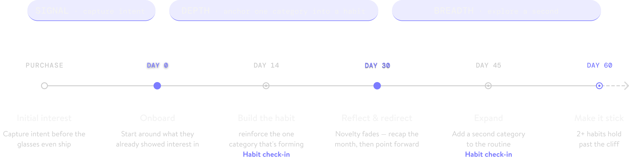
Retention lifecycle from purchase to day 60: signal, then depth across day 0–30, then breadth across day 30–60, with habit check-ins at day 14 and 45

One system, every surface. Each stage's goal plays out across
SocialEmailApp — heavier early, lighter later.

Principle 01
Depth before breadth
Anchor one habit, then expand. Users who go deep on a single feature hold far better than those who sample many.
Principle 02
Earn every moment
Reprioritize what already exists; add something new only when it's worth the interruption.
Principle 03
Follow the user's signal
Let what people already do choose what comes next.
The rollout
A rollout, planned in phases.
Phased rollout: the 30-day milestone ships, early results land, the model scales upstream to email and onboarding, then extends to new stages
Phase 1 · Pilot
Start at day 30 — the node that mattered most and needed the least coordination.
Phase 2 · Scale
With early results in, I led a sprint that took the model upstream to email and onboarding.
Phase 3 · Extend
Once both held, the journey kept growing: more teams join the roadmap.
Phase 1 · Pilot
The 30-Day Milestone.

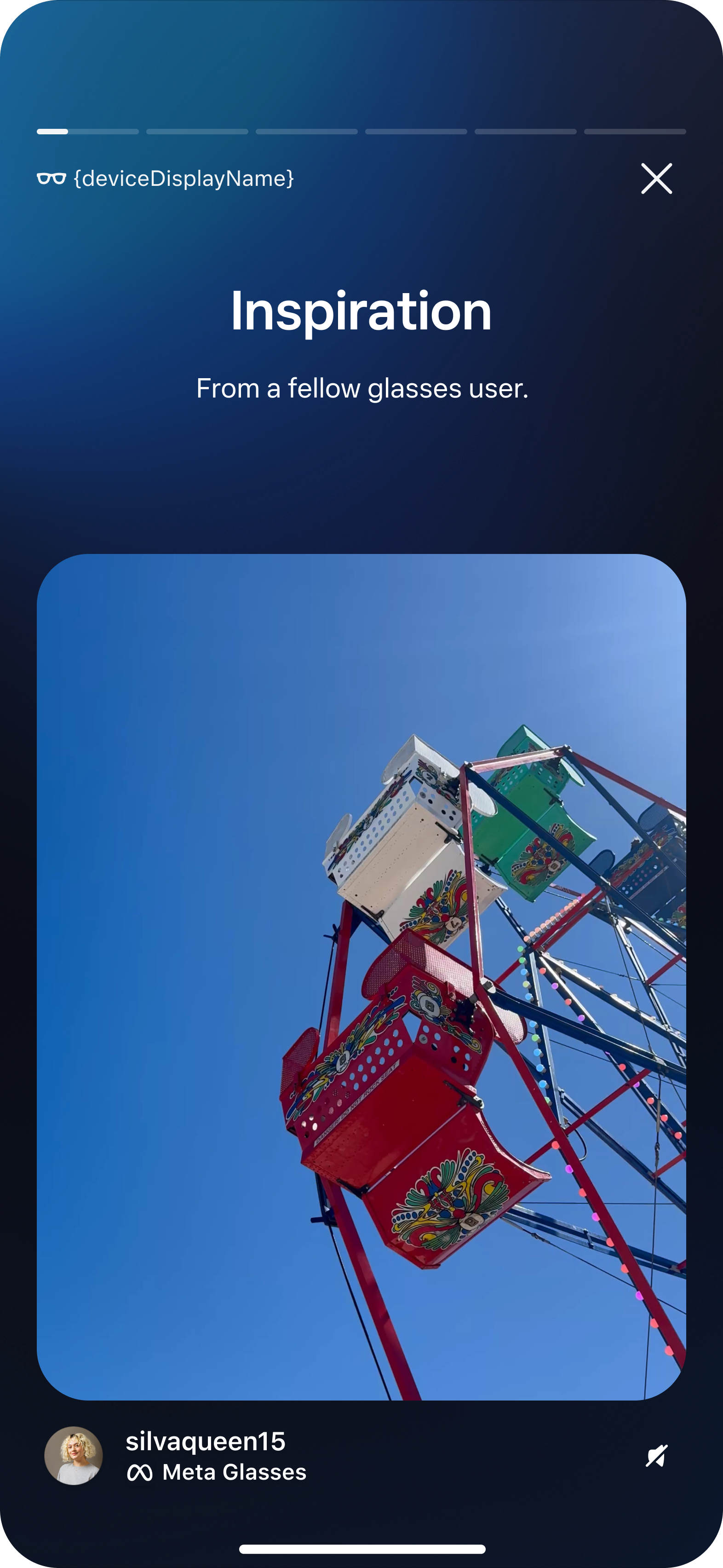
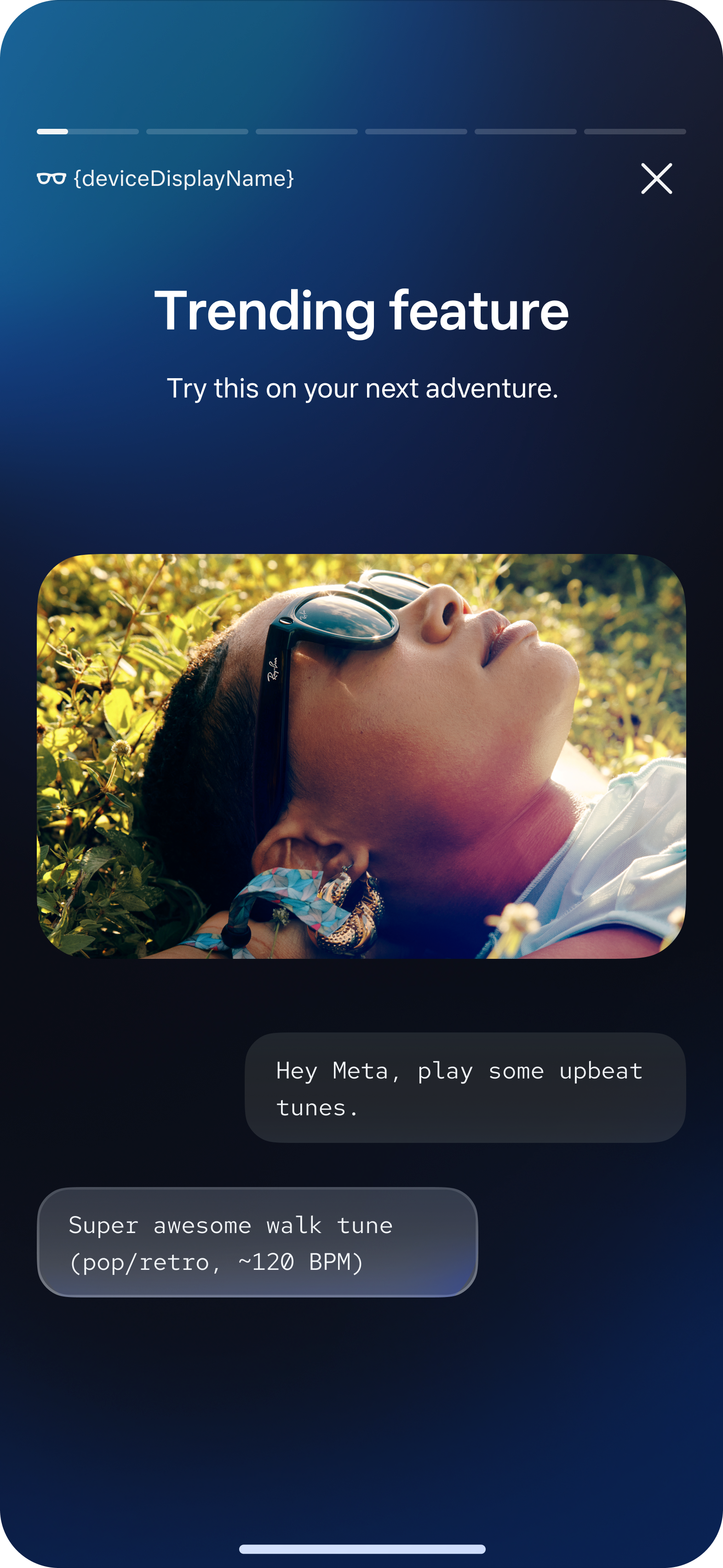
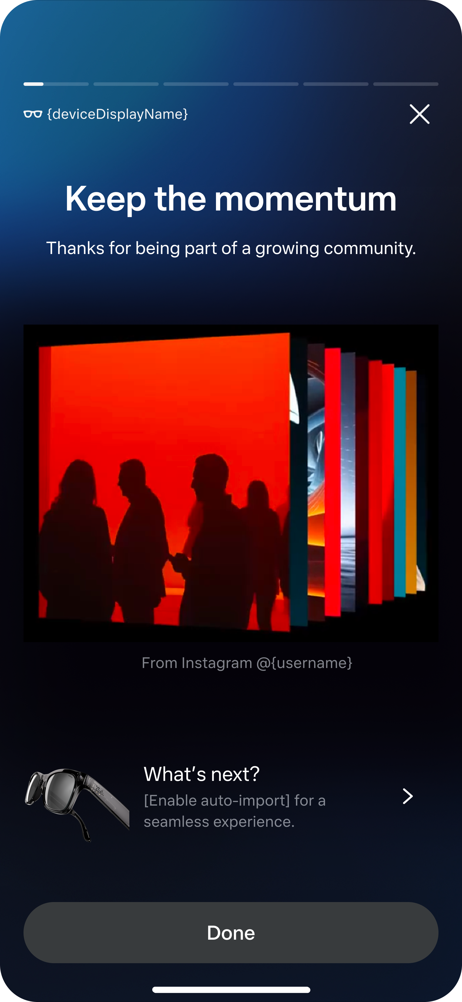
Shipped at day 30 — a five-page story that looks back just enough to feel personal, then turns forward: what to try next, and how other people actually use the glasses.

Early exploration

Research overturned the first direction.

The first direction was a Wrapped for your glasses — photos, top songs, personal stats, all built around your own month. We built it, put it in front of users, and it didn't land.
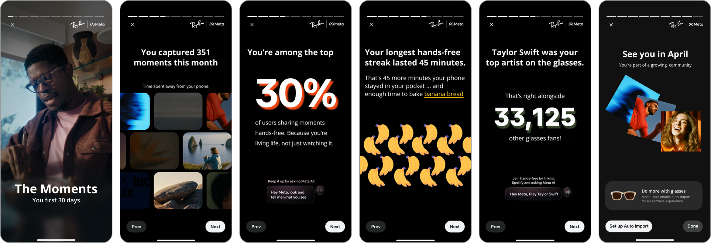
Early Wrapped-style direction: five story pages of personal photos, a top artist, usage stats, and a hands-free streak
The first direction · early exploration
UXR insights:
PrivacyTheir own photos felt exposing — and we couldn't reliably tell a good shot from a bad one.
Real usersThey wanted to see what real people do with the glasses, not marketing.
Worth $300?Unsure they were getting their money's worth, they wanted to know which features are trending.

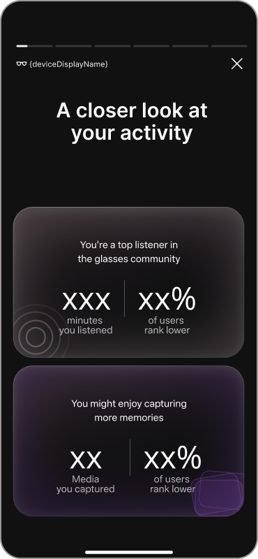
So the ratio flipped: one page looking back, three pointing forward. We renamed it too — not a Recap but a Milestone. A recap only looks back; a milestone marks where you are on a road.
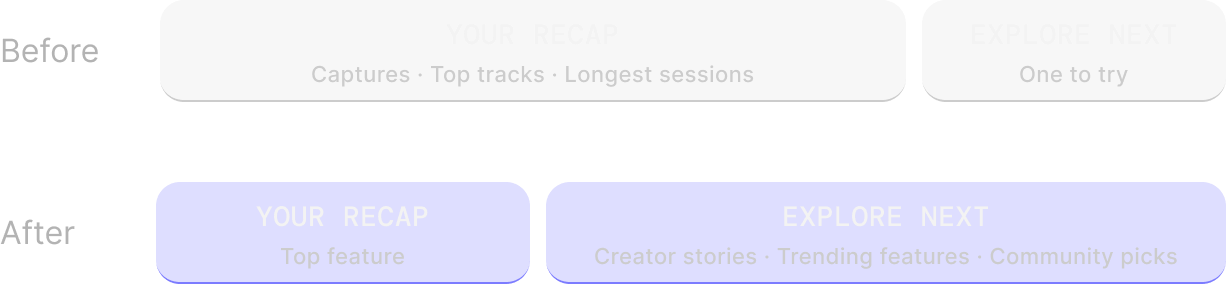
Before: a heavy recap — captures, top tracks, longest sessions — and one thing to try next. After: a light recap — top feature — and a heavy explore-next — creator stories, trending features, community picks.
The shipped flow
Day 30: look back once, then broaden forward.

The milestone marks that turn — and it's built to feel like it: story-style pages, a cinematic opening, full-bleed visuals. A moment to scroll.

01 · Opening
Revisit your first 30 days
02 · Look back
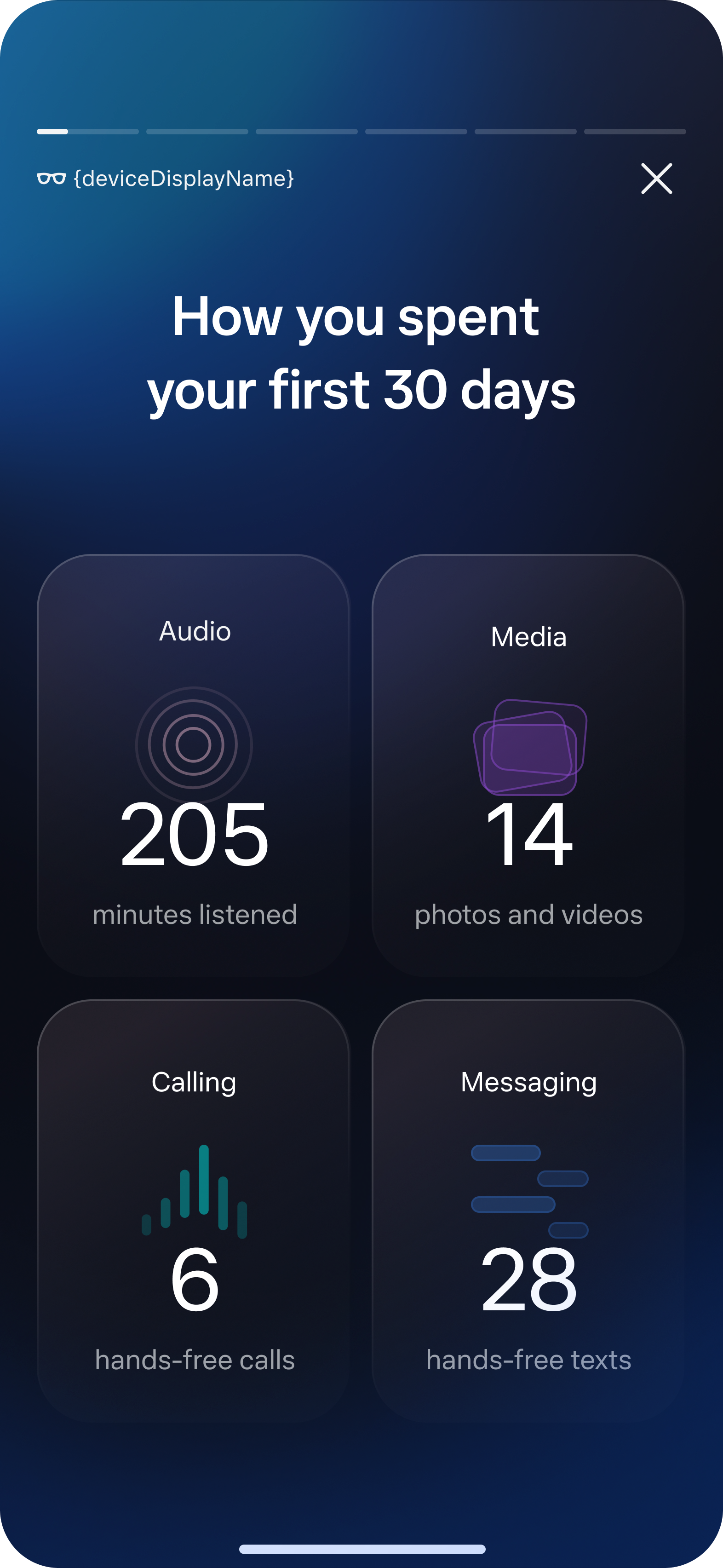
How you spent it
03 · Inspiration
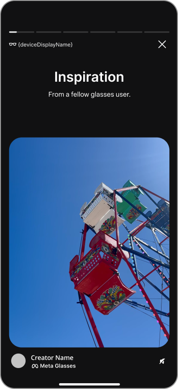
From a fellow user
04 · Guidance
Try this next
05 · Closing
Keep the momentum
Shipped product · personal data mocked for privacy.
Editing the content
Every element had to earn its place.

Not everything survived the redesign — knowing what to leave out is the judgment.
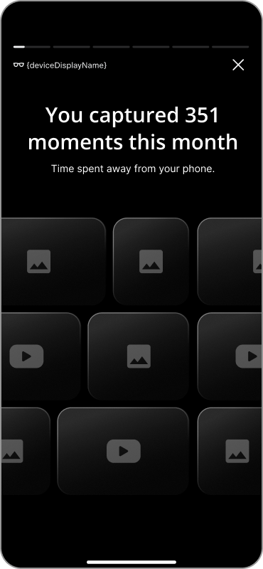
Photo gallery replaying captured moments, cut for privacy
Cut · privacy
The photo gallery
A grid replaying the moments you captured. Too personal to surface — and too uneven to reliably tell a good shot from a bad one.
Community comparison ranking you against other users, cut for legal reasons
Cut · legal
The community insights
How your month ranked against other owners. Legal flagged the aggregate community data as competitively sensitive.
Creator post from a fellow glasses user, swapped in for feature promotion
Swapped · inspiration
Feature promo → creator posts
Promotion reads as marketing; a real creator's post reads as worth copying.
The experiment
A test designed for the core hypothesis.

Split three ways.

A holdout group saw no Milestone. The rest were split by hero — capture-heavy users got Listening promoted, listening-heavy users got Capture — always the next most retentive category.

In both treatment groups, usage of the promoted feature rose — an early, positive read on the depth-to-breadth bet.
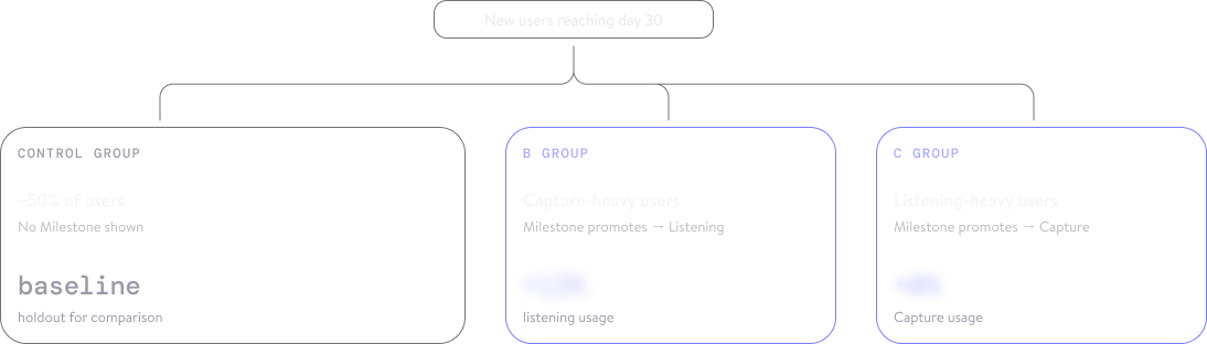
Experiment design: new users reaching day 30 split into a control group with no Milestone, and two treatment groups where the Milestone promotes the next most retentive category

They came back on their own.

The entry was built to show once, then step aside — yet people dug the Milestone out of their notification history to reopen it, some again and again. A pushed promo had quietly become something personal: observed behavior, not proven motive — and enough of a signal to reshape the roadmap that followed.

How it was built
AI-native, end to end.

I ran all four phases — concept, prototype, user testing, production — with AI in the loop. AI expanded directions and pre-tested the flow; I built the front-end in Claude Code and committed to the same codebase as engineering, then fixed UI directly in QA instead of filing tickets.

01
Design concept
Manus · Google Stitch
02
Iteration & prototyping
Claude Code · Google Stitch
03
Motion & visual design
Weavy AI
04
User testing & production
Claude Code · Meta AI coding

AI pushed execution toward zero. Judgment became the bottleneck — choosing the direction, holding the context, owning the quality.

Phase 2 · Scale
Connecting the dots.

Once the Milestone held, the framework moved upstream — to the days before onboarding even starts. Today the app shows a blank page until the glasses arrive; the redesign turns that wait into a pre-education moment that captures a signal, then spends it at day 0 to personalize onboarding — connecting touchpoints that already exist.
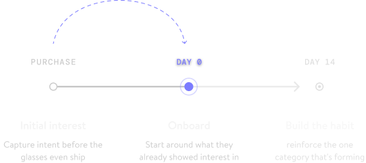
Connecting the dots: a signal captured before the glasses arrive, spent at day-0 onboarding

Get in touch for a closer look.

The takeaway

The right moment, the right signal, and the right level of interruption can turn retention from a push into a pull.

Next: Robotics Research Back to all work